spkit.stats.plot_groups_boxes
- spkit.stats.plot_groups_boxes(x, lines=False, xlabels=[], ylab='', title='', ax=None, box_palette=None, dodge='auto', notch=False, showmeans=True, show_box=True, lines_groups=[], group_colors=[], **kwargs)
Boxplot for Groups data
- Parameters:
- x: list of arrays
data groups
- lines: bool, default=False
- if True and if Data is paired (number of samples in each group are same),
lines are drawn to show the trends
- xlabels: list of str
names for each group,
should have same length as number of groups
- ylab: str, default=’’
label for ylabel
- title: str, default=’’
tilte of figure
- ax: ax obj, default=None
None then created using
fig, ax = plt.subplots()
- box_palette: str, list of str, default=None
color palette for boxes
if None, default color palette
example: box_palette on of
{'pastel','husl','Set2','Spectral','flare'}Or -
box_palette = ['C0','C1', 'C2' ..]
- dodge: bool,default=’auto’,
to avoid overlap, ‘auto’ sets itself
- notch: bool, default=False,
if False, then rectangular boxes as boxplot
if True triangular shape style
- showmeans: bool, default=True,
If True, show mean of the data, with properties
meanprops
- show_box: bool, default=True,
if False, boxes are not show,
useful to show points only,
- lines_groups: list, default=[]
grouping the lines with colours
- for example:
lines_groups = [0,1] means points where
group 1 is greater 2, it is one group
see example
- group_colors: list, default=[]
colours for groups of lines
- kwargs:
There are other arguments which can be supplied to modify the plots.
Default setting is: *
line_kw=dict(lw=0.5,ls='--',color='k')for line *line_marker_kw = dict(marker='.',ms=3,color='k',lw=0)for dot on lines *meanprops=dict(ms=10,marker='o',markerfacecolor='r')for means *box_kw =dict(width=0.5)for boxes *strip_kw=dict(color="0.1")for dots when lines are not used
References
Examples
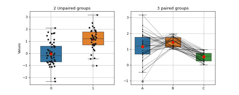
#sp.stats.plot_groups_boxes
import numpy as np
import matplotlib.pyplot as plt
import spkit as sp

np.random.seed(1)
x1 = np.random.randn(50)
x2 = np.random.randn(40)+1
x3 = np.random.rand(40) +1
x4 = np.random.rand(40)

fig, ax = plt.subplots(1,2, figsize=(10,4))
sp.stats.plot_groups_boxes(x= [x1,x2], ax=ax[0],title='2 Unpaired groups',ylab='Values')
sp.stats.plot_groups_boxes(x= [x2,x3,x4],ax=ax[1], lines=True, xlabels=['A','B','C'],title='3 paired groups')
plt.show()
Examples using spkit.stats.plot_groups_boxes
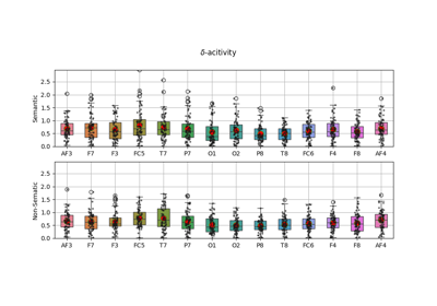
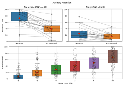
EEG Computing Rhythmic Features - PhyAAt - Semanticity